


PANTONE® say dusky pink and lilac blue will soothe you through a frenetic 2016

 Together, PANTONE feel Rose Quartz and Serenity represent connection, wellness, mindfulness and inner peace – along with gender blur, equality and fluidity.
 So it’s a heady challenge we set for ourselves this week as we strive to bring you relaxing, peaceful wallpapers worthy of these twin Dalai Llamas of the colour world.
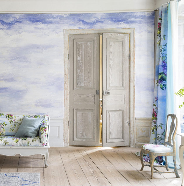
Sandberg’s lovely Skymning get’s us drifting off into the calmest start.
So it’s a heady challenge we set for ourselves this week as we strive to bring you relaxing, peaceful wallpapers worthy of these twin Dalai Llamas of the colour world.
Sandberg’s lovely Skymning get’s us drifting off into the calmest start.
 Villa Nova’s Bowood Shell is a meditatively dusky pink stripe
 Sanderson’s Flamingos exemplify balance and coolness on one leg.


PANTONE colours of the year 2016
Every year, the colour gurus in Pantone Towers unveil their colour of the coming year, setting the tone for colour trends in fashion and design. This time round they’re treating us to not one but two delightfully dreamy tones they hope will point us to peacefulness and tranquility in the turbulent world of 2016. Imagine wispy clouds in a dusky Summer sky and you’ll get the gist of things.ROSE QUARTZ
Warm and embracing…
SERENITY
Cool and tranquil…
Together, PANTONE feel Rose Quartz and Serenity represent connection, wellness, mindfulness and inner peace – along with gender blur, equality and fluidity.
So it’s a heady challenge we set for ourselves this week as we strive to bring you relaxing, peaceful wallpapers worthy of these twin Dalai Llamas of the colour world.
Sandberg’s lovely Skymning get’s us drifting off into the calmest start.
Villa Nova’s Bowood Shell is a meditatively dusky pink stripe
Sanderson’s Flamingos exemplify balance and coolness on one leg.
Albany’s Geometric Trail introduces a little blur across the boundaries of its soothing colours.
Waves meet clouds as sky and sea become one in Osborne and Little’s Marmara
And the Cielo Panel by Designers Guild pastes an indigo sky across your walls for inner peace.
Matthew Williamson’s Danzon boasts a blurry zigzag with touches of lilac and indigo.
Cole & Son’s geometrically magical Apex offers a well-grounded structure of light and shade for reflection whichever way you look at it.
So thank you Pantone, for steering us on the path to colour enlightenment for 2016. Peace, love, Serenity and Rose Quartz to walls everywhere!